More Than a Distraction: ADHD as a Chronic Neurodevelopmental Disorder
A deeper look into how Attention-Deficit/Hyperactivity Disorder is understood beyond the surface-level label of “inattention.
Read More
A new partnership between MedReCon and the YES Meeting
A new partnership between MedReCon and the YES Meeting has been announced as part of this year’s program.
Read More
Breaking the Chronic Pain Cycle: Ultrasound-Guided TAP Block
Hands-On Workshop with Ivan Keser, MD, PhD. Ready to step beyond textbooks and into real procedural medicine?
Read More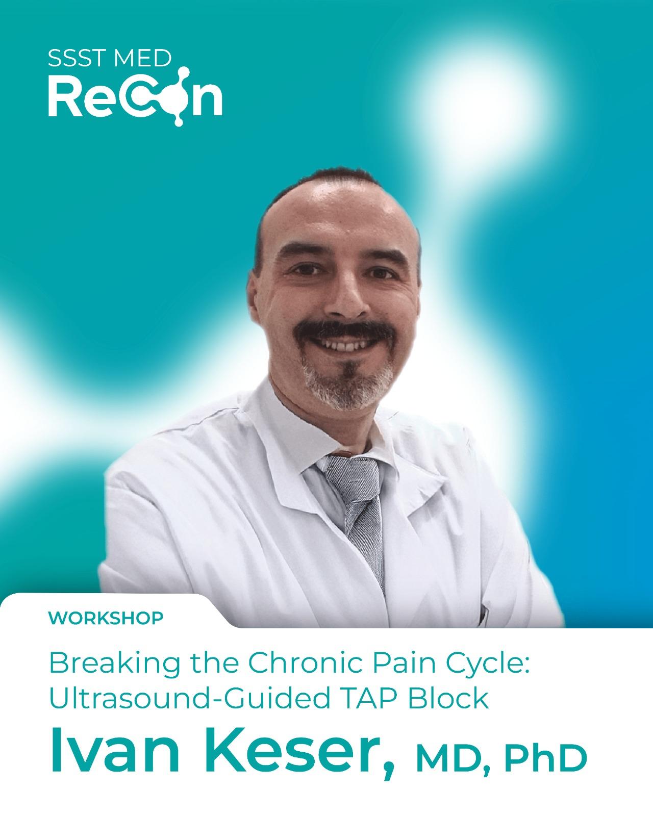
When Chronic Turns To Acute: MedReCon Workshop
What happens when a stable patient suddenly isn’t?
Read More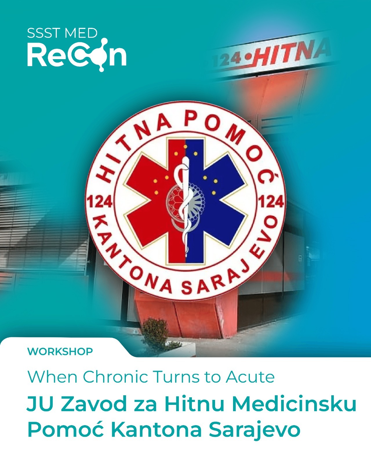
Beyond Willpower: Obesity as a Medical Condition
With over 20 years of experience in endocrinology and diabetes care, Dr. Selma Jusufović brings deep clinical insight into one of the most pressing health challenges of our time.
Read More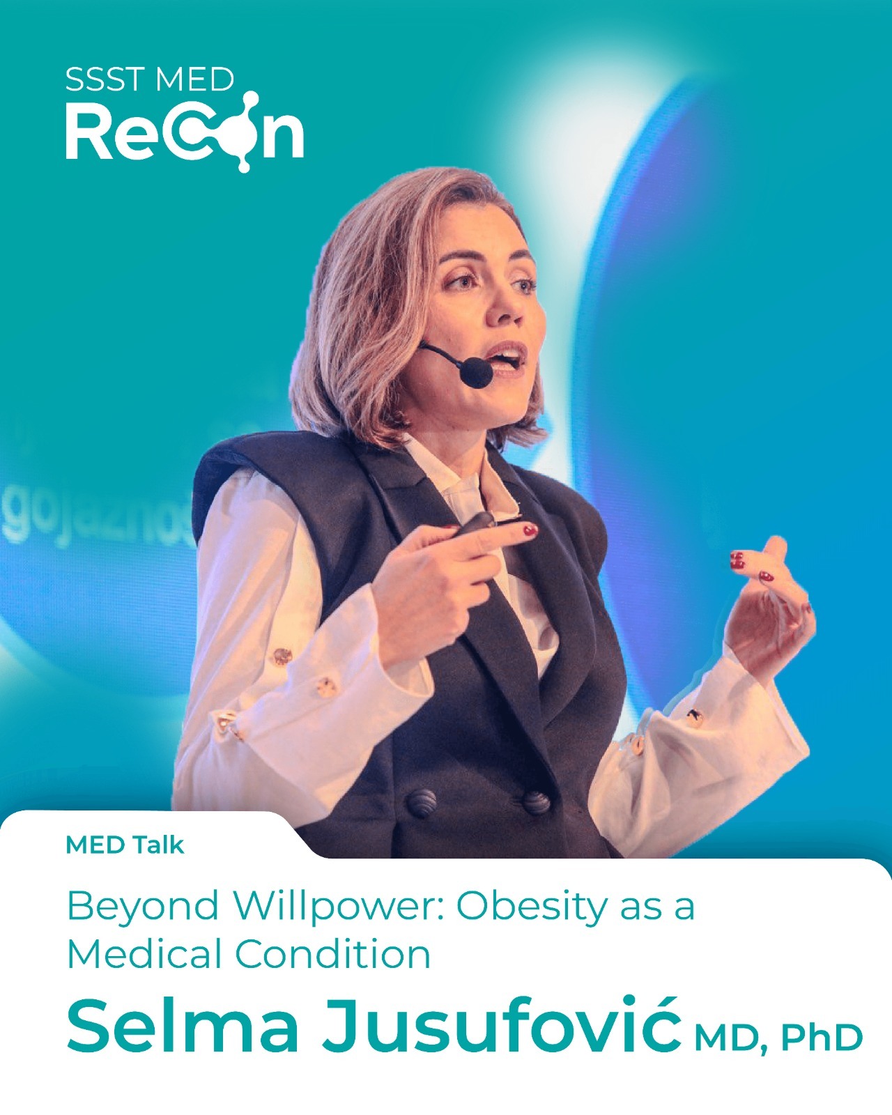
Living with Limits: CPET in Chronic Diseases
A new workshop titled “Living with Limits: CPET in Chronic Diseases” is set to spotlight how chronic illnesses shape a patient’s ability to breathe, move, and function in daily life.
Read More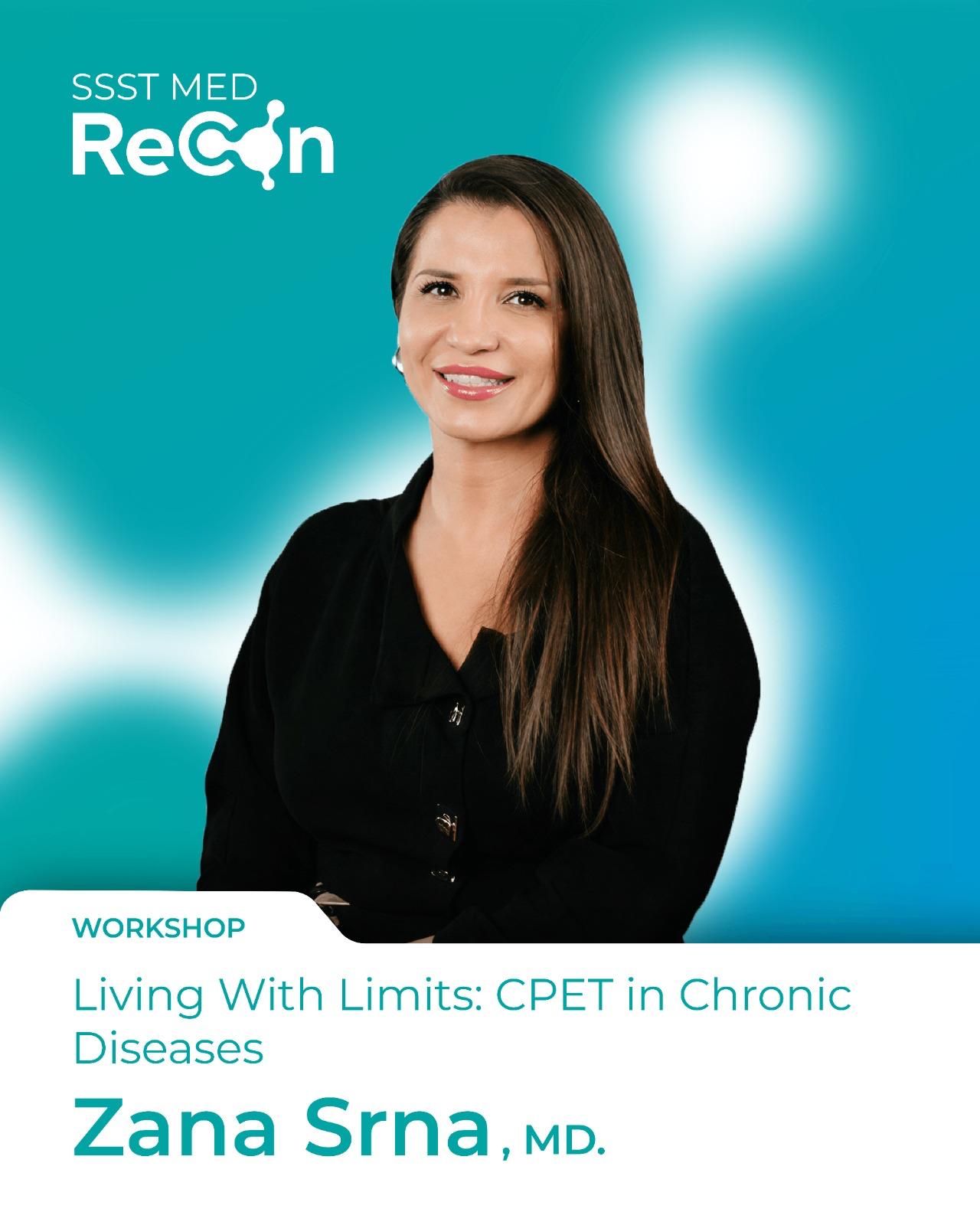
When Chronic Diseases Meet Minimally Invasive Techniques – VATS
Don't Miss This Featured MedRecon Workshop with leading thoracic surgery expert.
Read More